The AI design soup
While working on domainbot.ch (an application to detect new *.ch domain names) I of course also tested my own product.
This led me to visit some (ok, a lot) of domains and websites.
And while doing so, I noticed that a lot of those fresh websites looked pretty similar. A bit too similar.
I tried to find out whether those were based on the same CSS Framework (like 10 years ago where you could tell that a lot of websites were based on the Bootstrap CSS framework). But so far I don’t think they are…
It looks like they are AI generated - at least that’s my impression and that might be wrong in single cases or in general.
An additional aspect seems to be that this observation is not bound to a single area or topic (e.g. only transportation). Instead, I see this all over the place, on whebsites of carpenteners, health care, limousine services, online-marketing, construction, …
A note in general: I’m a system engineer and usually my computer’s screen is coverend with a text-editor and a bunch of Terminals (aka black background square filled with white or colored text, but fully text-based) - and a web-browser to consume content on that Internet. But I’m by no means a designer. So it feels a bit odd for me, to write about design. In case any real designer out there thinks I’m completely on the wrong path with what I show below, I’d be more than happy to hear from you and learn about a design-trend I missed 😉
To categorize or not to categorize
While collecting some examples for this blog post, I started to categorize them, just to find out that’s not really working out as some sites would match to multiple of those categories.
So I turned that around, away from categories to indicators, and the mentioned sites can tick boxes for one, or multiple of those indicators at the same time.
Some of the indicators I found are shown below, with some corresponding examples:
Indicators of AI web-design
Serif Headlines
While Serif-Fonts are definitely nothing new, I see them having a renaissance these days. They were used for longer blocks of text and as far as I know, that’s because of the serifs enhancing the readability of letters in a longer paragraph of text. But something that seems to be new-ish is to see so many Headlines in Serif-Fonts. Sometimes only the headlines, sometimes the whole website is serif-based - and not because there are longer blobs of text.
Screenshot of bebeenroute.ch front-page, taken 2026-11-07 Screenshot of leobodenbeläge.ch front-page, taken 2026-11-07 Screenshot of pamoox.ch front-page, taken 2026-11-07 Screenshot of isapapillon.ch front-page, taken 2026-11-07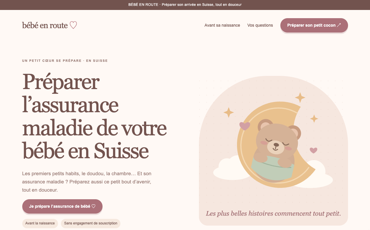
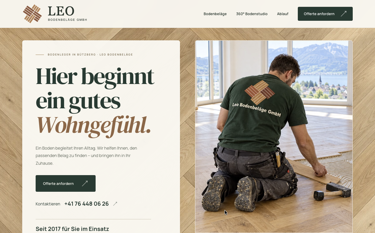
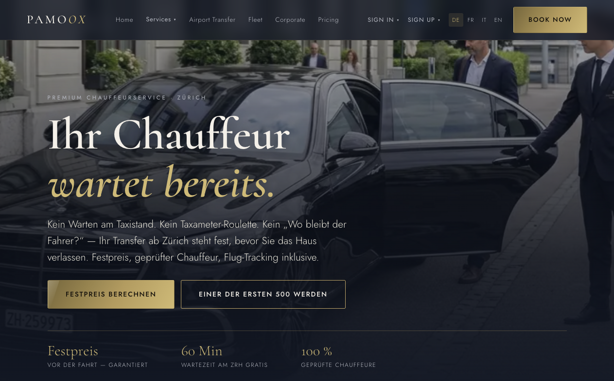
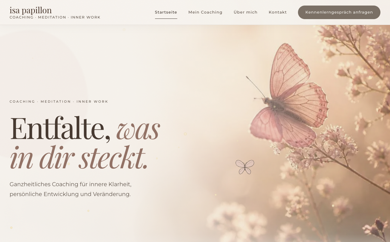
Color-Themed
Sites showing a lot of elements shown in a single color, or variants of that color. Often in color-families that were not seen that often (e.g. tones of violet, green, pink).
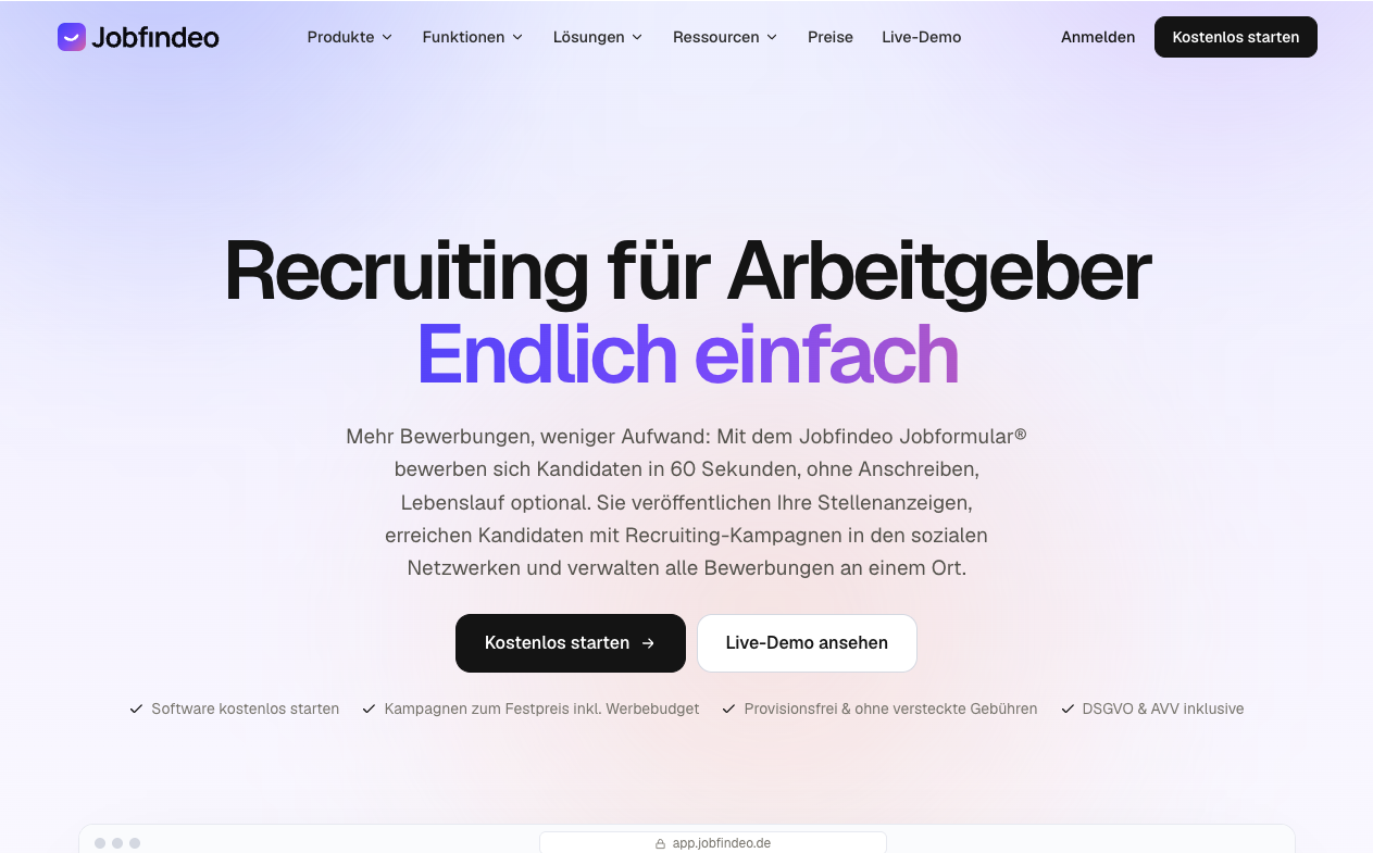
Screenshot of noverion.ch front-page, taken 2026-11-08 Screenshot of jobfindeo.ch front-page, taken 2026-11-08 Screenshot of gluschtbox.ch front-page, taken 2026-11-08 Screenshot of plusdeclients.ch front-page, taken 2026-11-08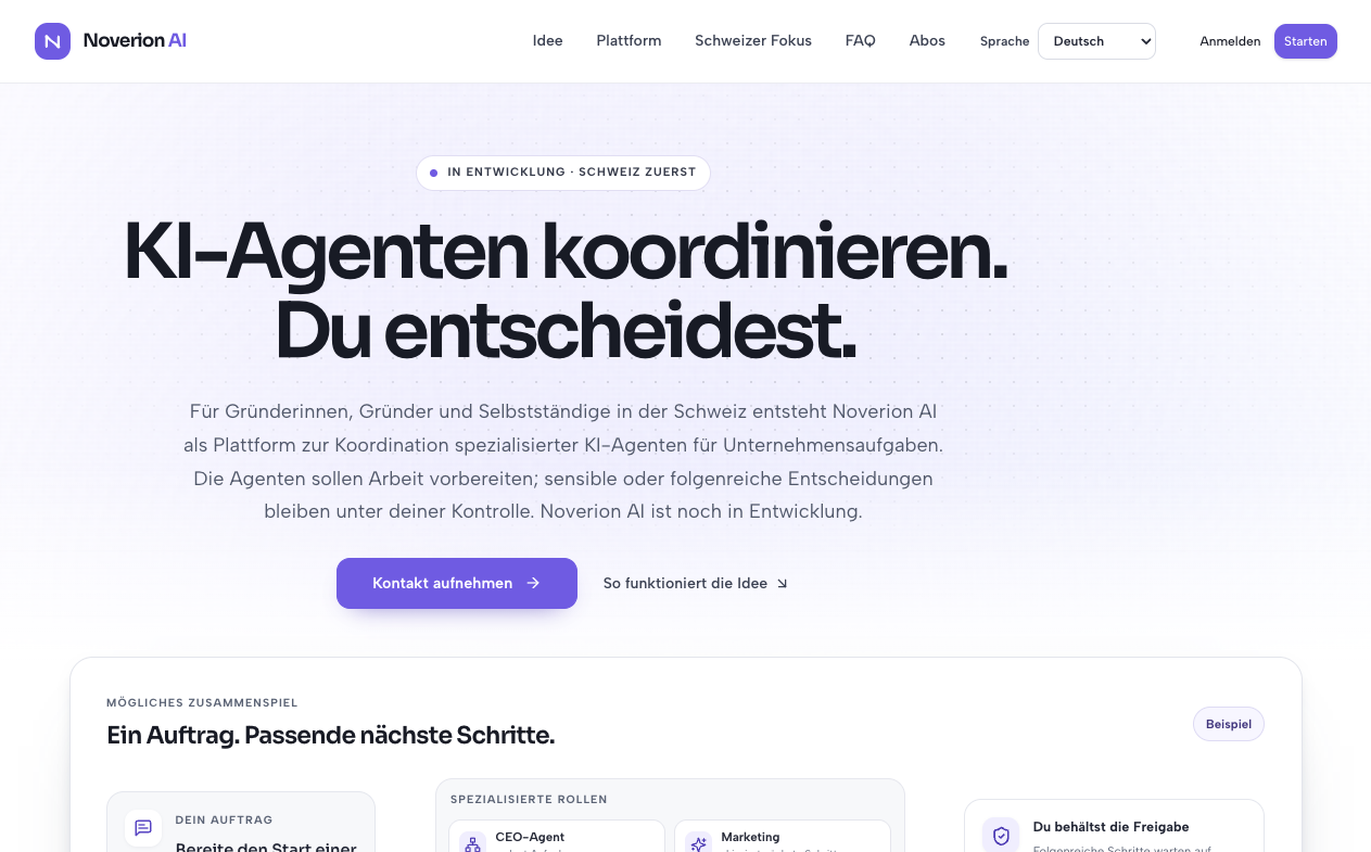
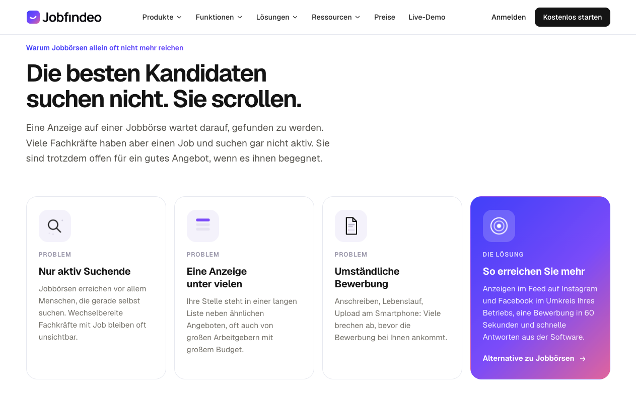
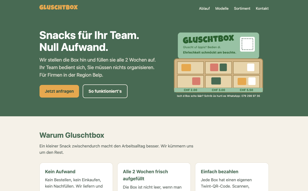
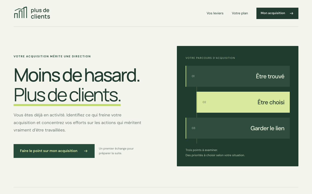
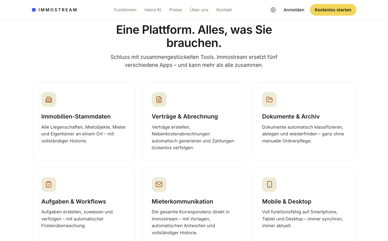
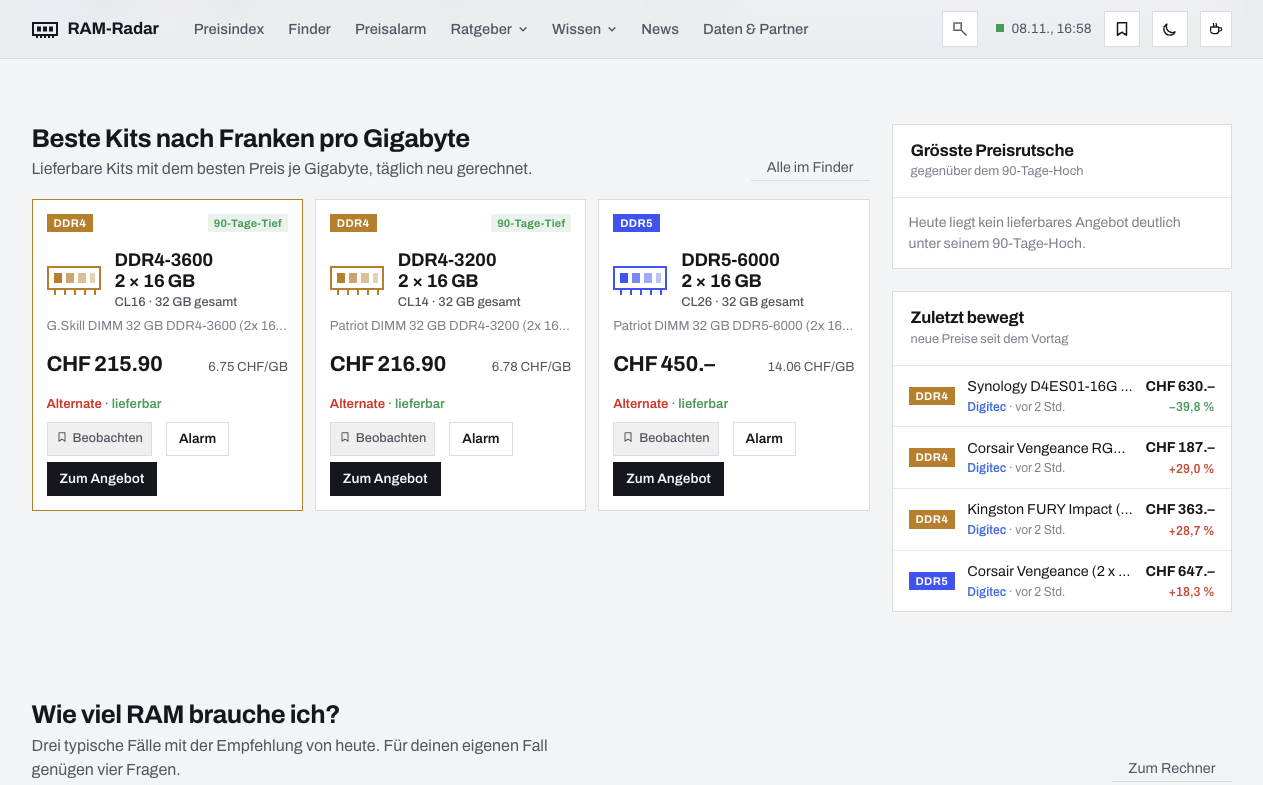
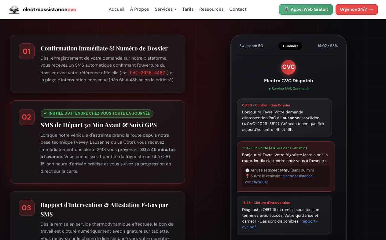
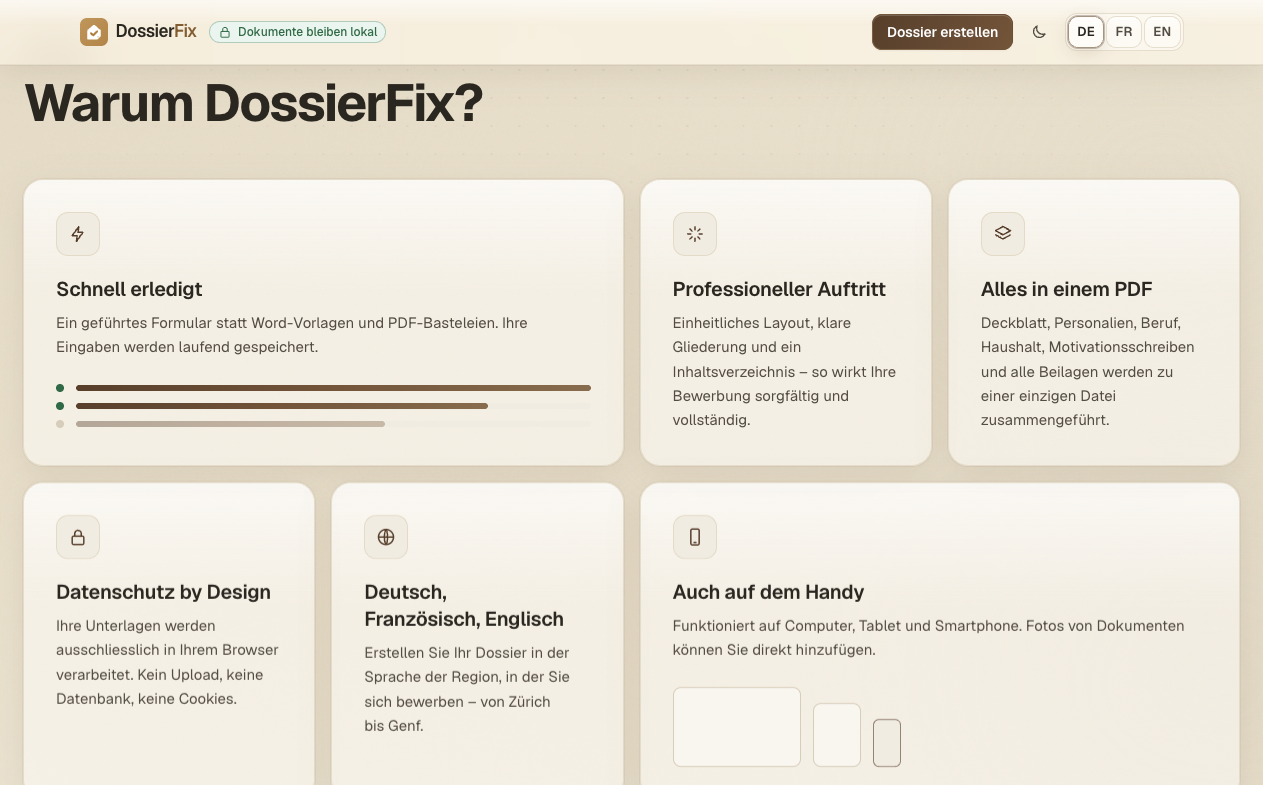
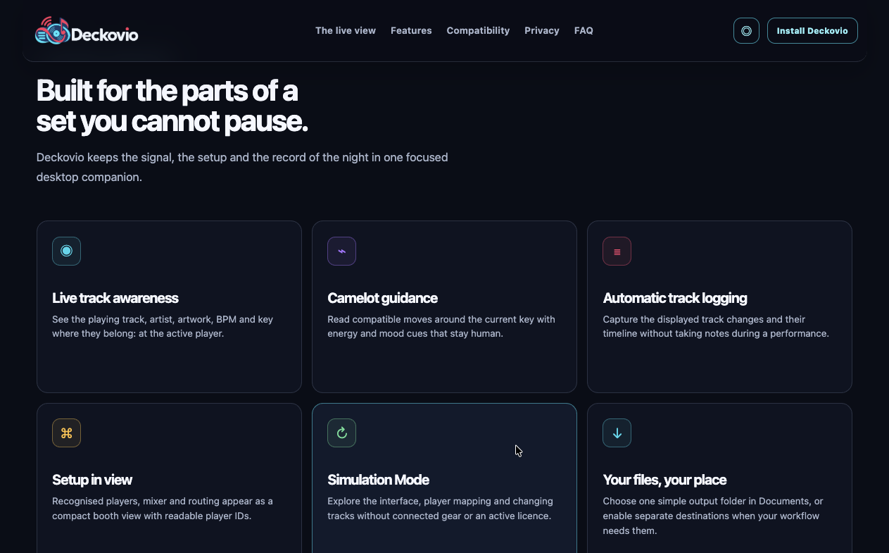
App-Style, cards
For sites that either look like an app themselves, showing a lot of details and (pseudo?) updated data. Or sites that do marketing for a potentially vibe-coded app. And as apps tend to show cards or little boxes in their UI, so do those websites.
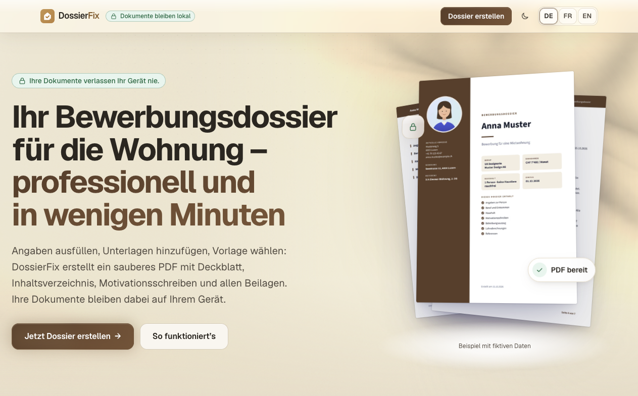
Screenshot of batibudget.ch front-page, taken 2026-11-08 Screenshot of immostream.ch front-page, taken 2026-11-08 Screenshot of ram-radar.ch front-page, taken 2026-11-08 Screenshot of electroassistance-cvc.ch front-page, taken 2026-11-08 Screenshot of dossierfix.ch front-page, taken 2026-11-08 Screenshot of deckovio.ch front-page, taken 2026-11-08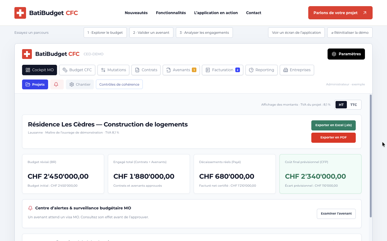
Overloaded and repetitive
Here’s a section without any screenshots to not make this post a log longer.
Many pages come as one-pagers and are stuffed with content. This makes deployment a lot easier from the technical perspective (just one HTML file + some image-files perhaps). But often it’s a bad choice to make pages longer and longer, often containing repetitive sections. Longer is not always better. To me, some of the pages feel like they want to convince me, hitting me with one argument after the other.
I don’t like this. Because it often does not fit the company or product. And like images that don’t fit, also text can be the same.
Imaginge a (made up!) example of a one-man electrician’s website - stuffed with details, repetitive and all in all long like a book.
I guess you get my point :-)
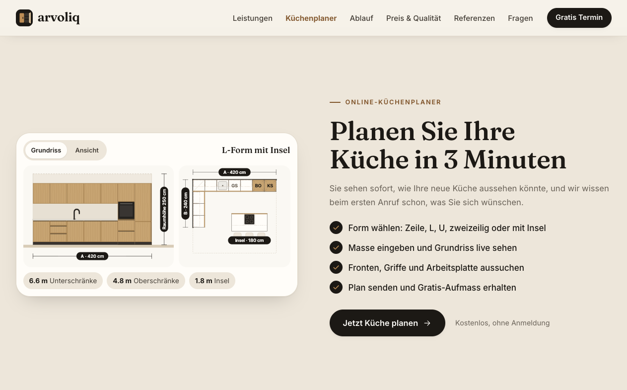
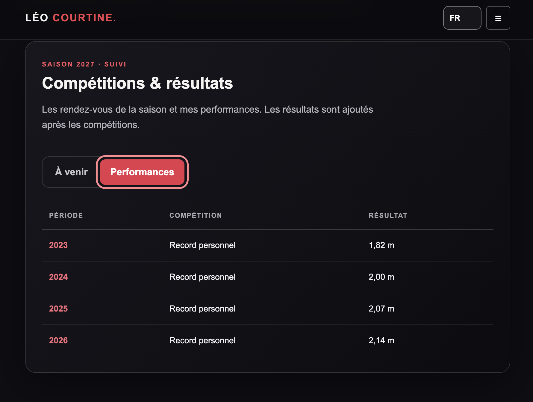
Facts and promises
Sites showing a lot of numbers, facts or promises like “+300% in revenue”. Or whom of you planned their home’s kitchen in 3 minutes? Some offerings just seem to be too good to be true… (Yes, not only the AI seems to fantasize and over-estimate, humans are good at that, too - especially marketers and sales folks I guess)
Screenshot of igormakarov.ch front-page, taken 2026-11-10 Screenshot of arvoliq.ch front-page, taken 2026-11-08 Screenshot of leocourtine.ch front-page, taken 2026-11-10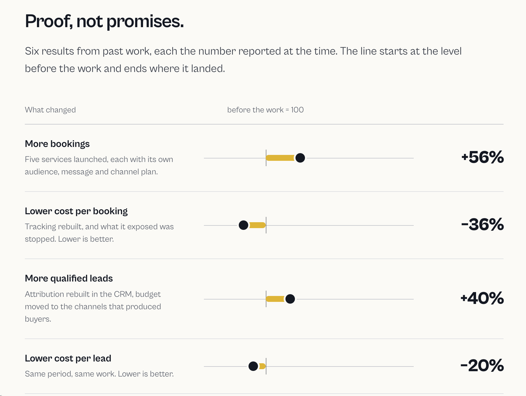
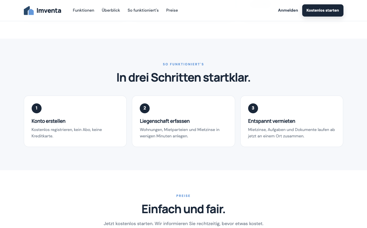
Steps
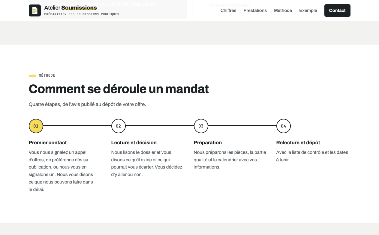
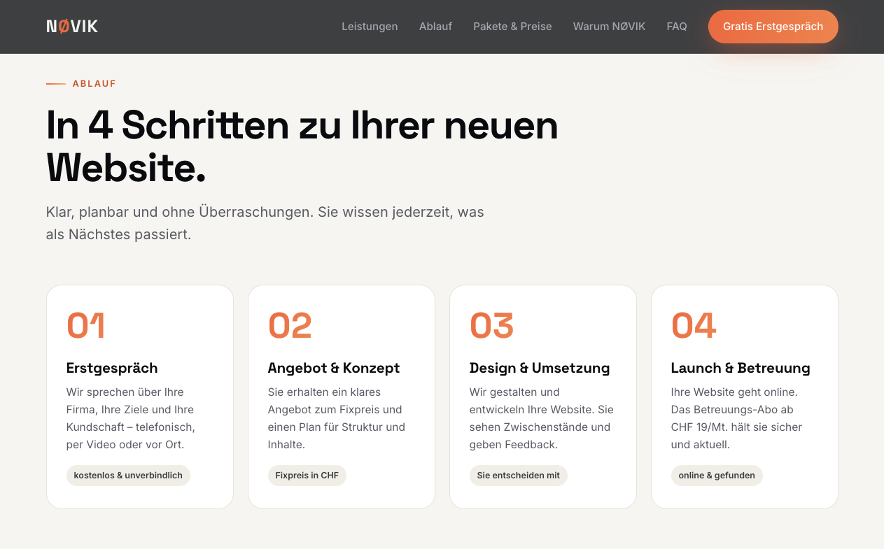
Sites showing numbered steps of what’s possible with this product or company, or how to work together.
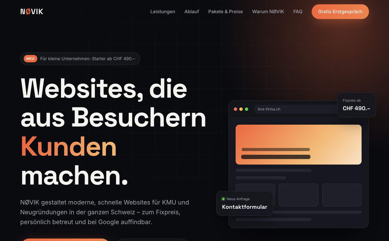
Screenshot of marketing247.ch front-page, taken 2026-11-08 Screenshot of atelier-soumissions.ch front-page, taken 2026-11-08 Screenshot of novik.ch front-page, taken 2026-11-08 Screenshot of imventa.ch front-page, taken 2026-11-08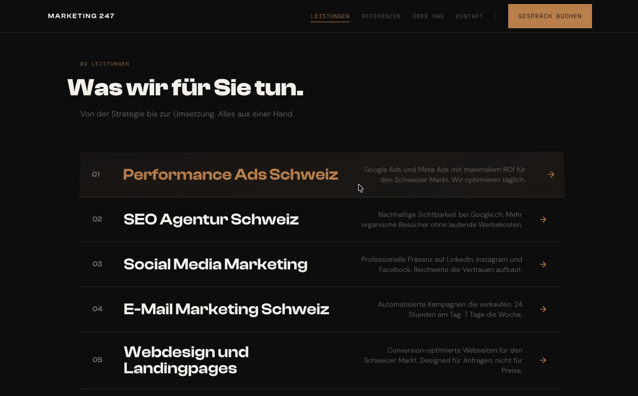
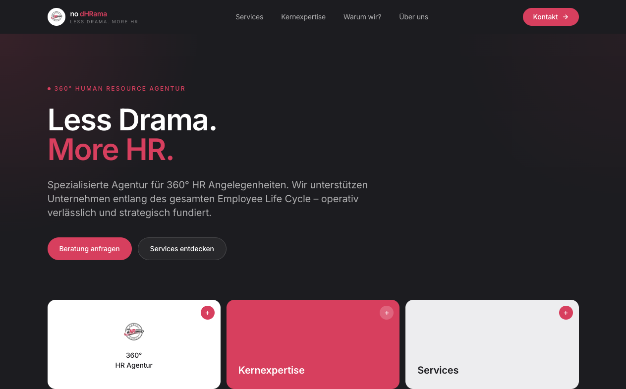
Colored single words
Single words of a sentence or title in a different color or font, partially even rainbow-colored.
Screenshot of chessit.ch front-page, taken 2026-11-08 Screenshot of nodhrama.ch front-page, taken 2026-11-08 Screenshot of jobfindeo.ch front-page, taken 2026-11-08 Screenshot of novik.ch front-page, taken 2026-11-08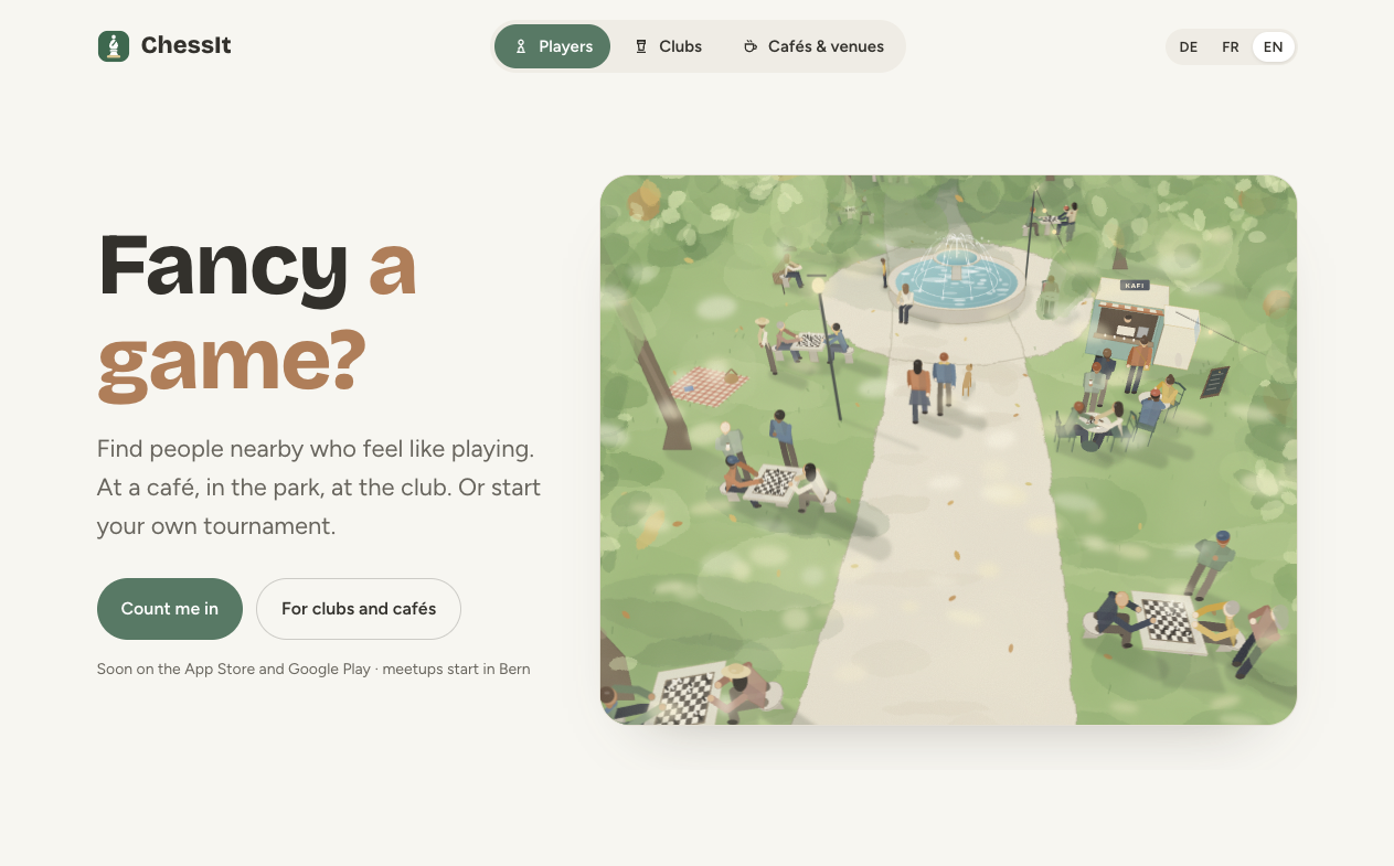
Generated images and animations
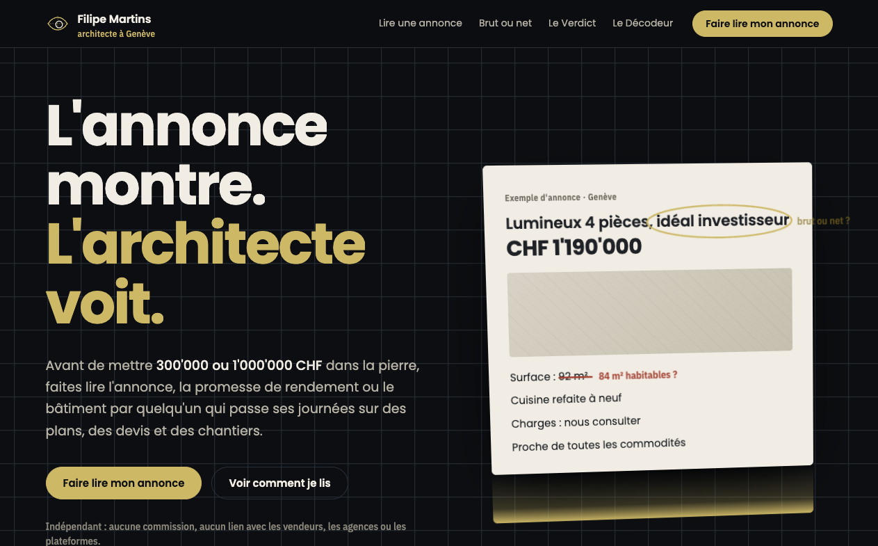
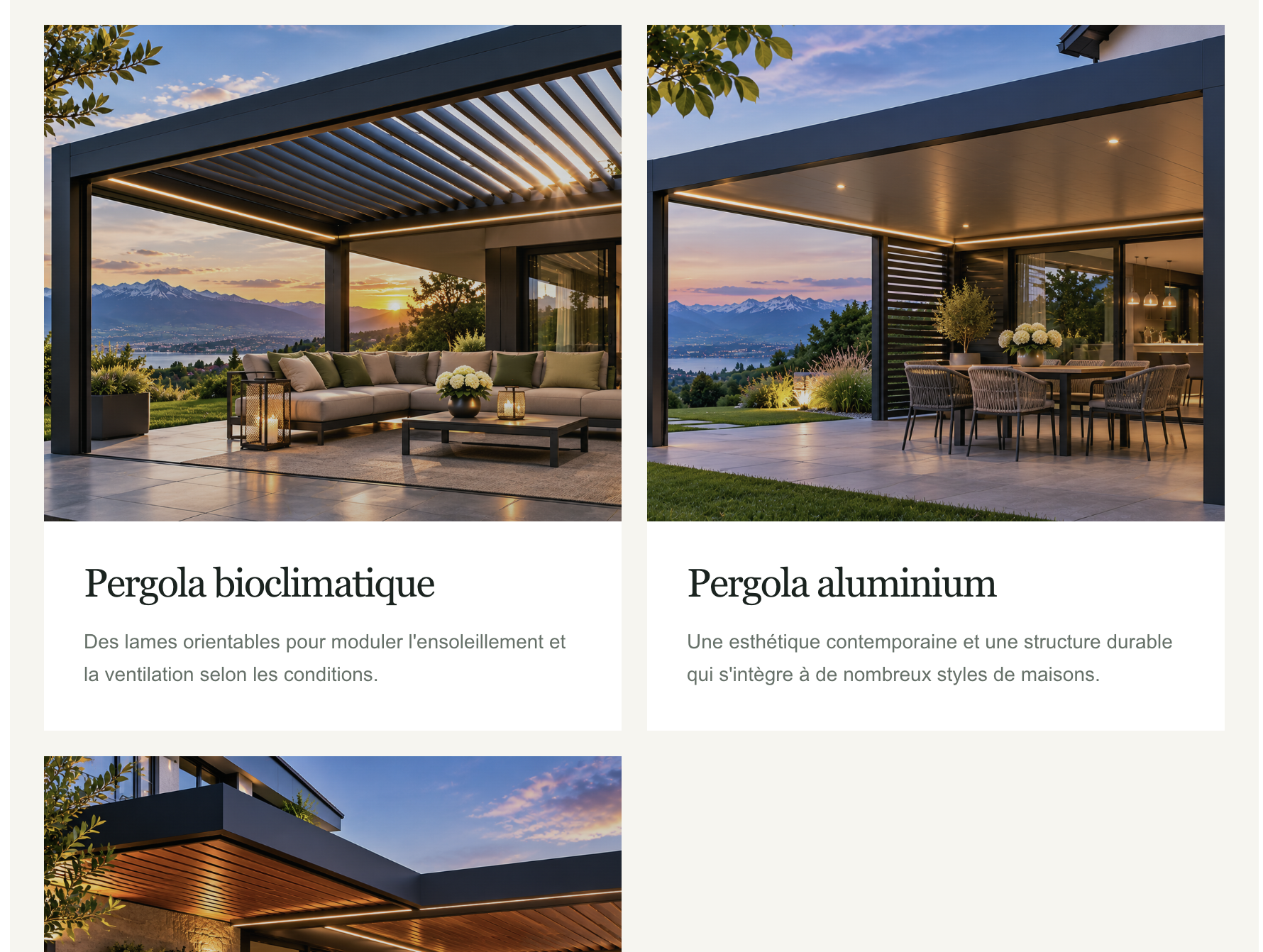
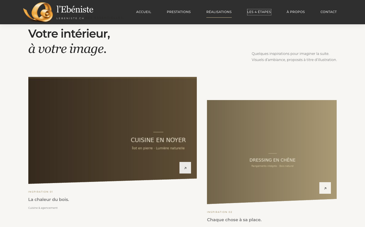
There used to be lots of websites that used stock-images. This seems to have shifted towards the use of generated photos, or photos that are heavily modified to match the color-tone of the website. And I’ve found animations that look like “too clean”, often on top-right of the front-page. They by itself are not wrong, but they look generated, when a one-person shop’s website contains such animations that would probably be too expensive when custom-made by a professional.
Screenshot of lebeniste.ch front-page, taken 2026-11-08 Screenshot of dossierfix.ch front-page, taken 2026-11-08 Screenshot of filipemartins-architecte.ch front-page, taken 2026-11-08 Screenshot of installation-pergola.ch front-page, taken 2026-11-08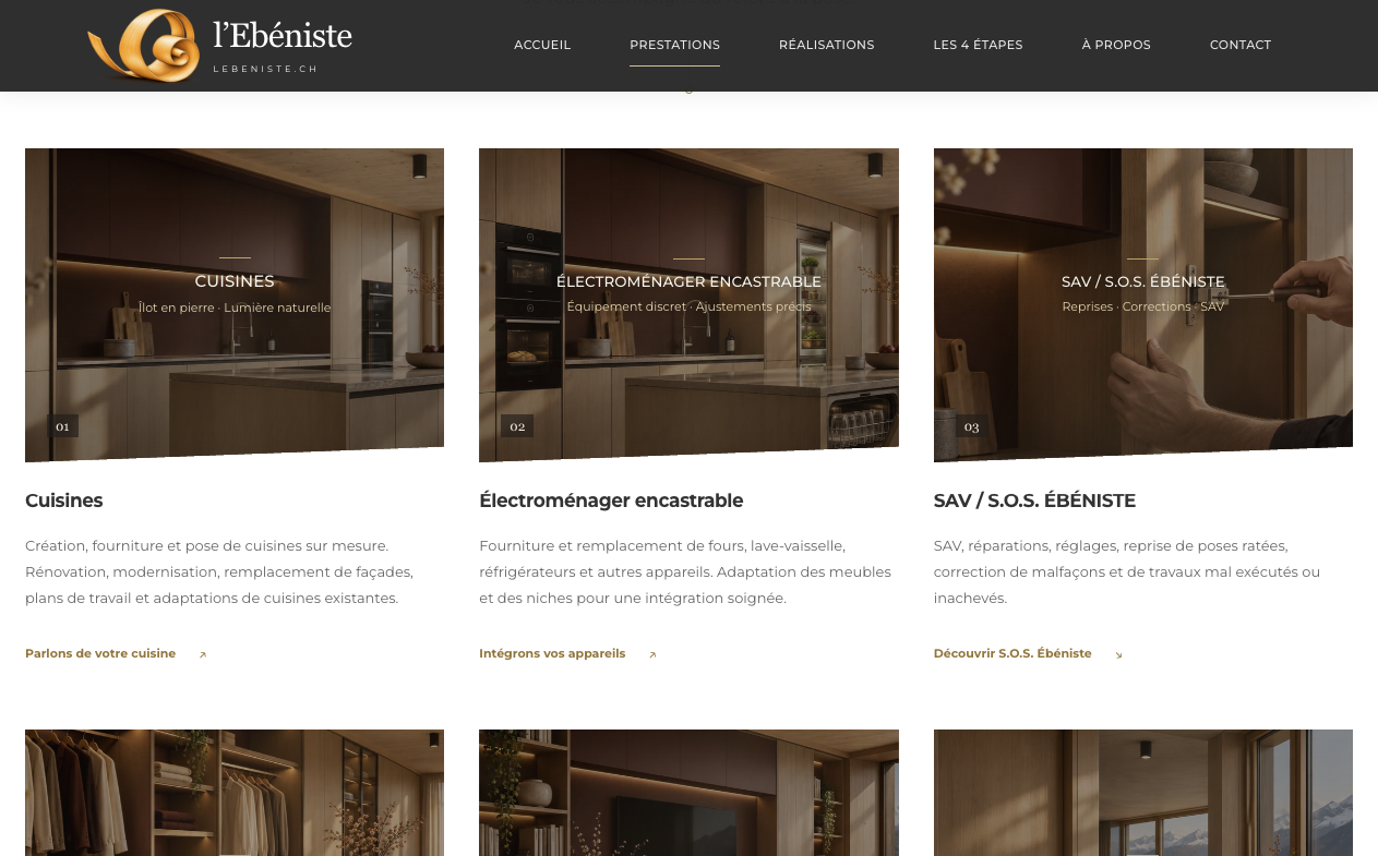
Unfinished
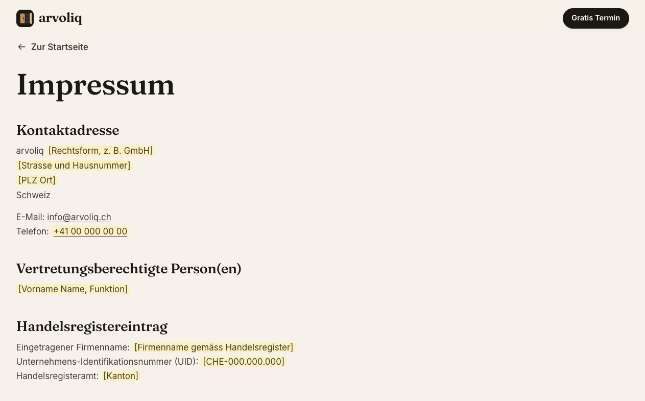
Online but not finished, contains placeholder-images and placeholder-Text to be replaced. Especially if the contact or impress-pages are still showing placeholder-text where even the company’s name or legal-form is not yet decided.
Screenshot of kompar.ch front-page, taken 2026-11-08 Screenshot of arvoliq.ch impress-page, taken 2026-11-08 Screenshot of lebeniste.ch impress-page, taken 2026-11-08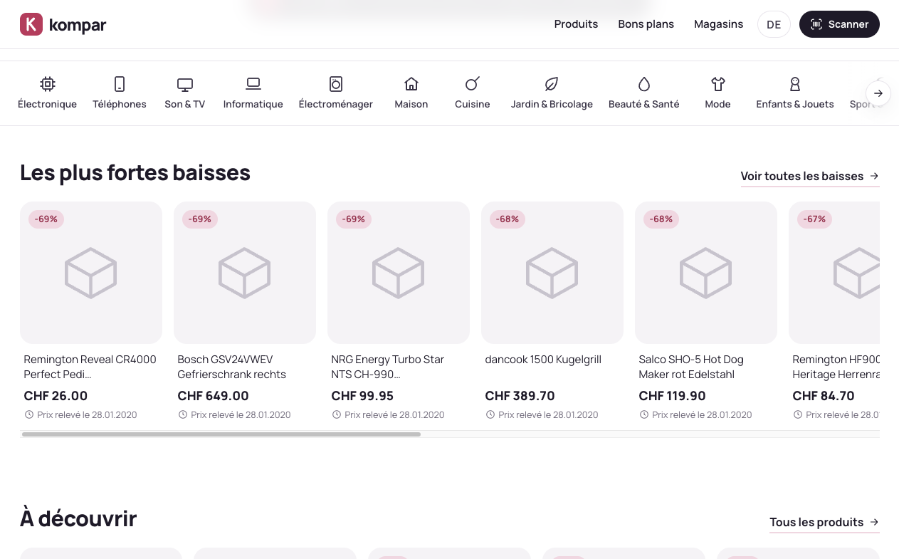
Conclusions
From what I’ve seen, collected, sorted and categorized, I guess many of those websites were vibe-coded with AI assistance - or even completely AI-coded. While this might of course speed up time to market for startups and new businesses what is basically good - I still doubt this is the right approach to just “throw it out”, even unfinished. Readability is often not ideal (too much text), and design-wise it gets boring to see the same AI Design-Soup over and over again, just for different companies.
It was fun collecting those sites and compiling this post. But I hope we all together will do better in the future and (not just for the web-agencies that struggled lately) that we manage to bring the craftmanship and quality back to the table. I prefer a shorter, personally written, less-over-polished website over one that is lenghty, stuffed with details, and with imagery that does not “fit”.